The Project
The Terra digital marketing agency was having a bit of an identity crisis.
Our previous name (Thunderfoot) and brand didn't represent who we really were: an adaptable team of international experts who form close collaborative partnerships with our clients.
We spent 6 months doing the deep work necessary to conduct a complete brand reinvention based on our core personality, our unique blend of capabilities, and a new globally-inspired name: Terra.
The Palette
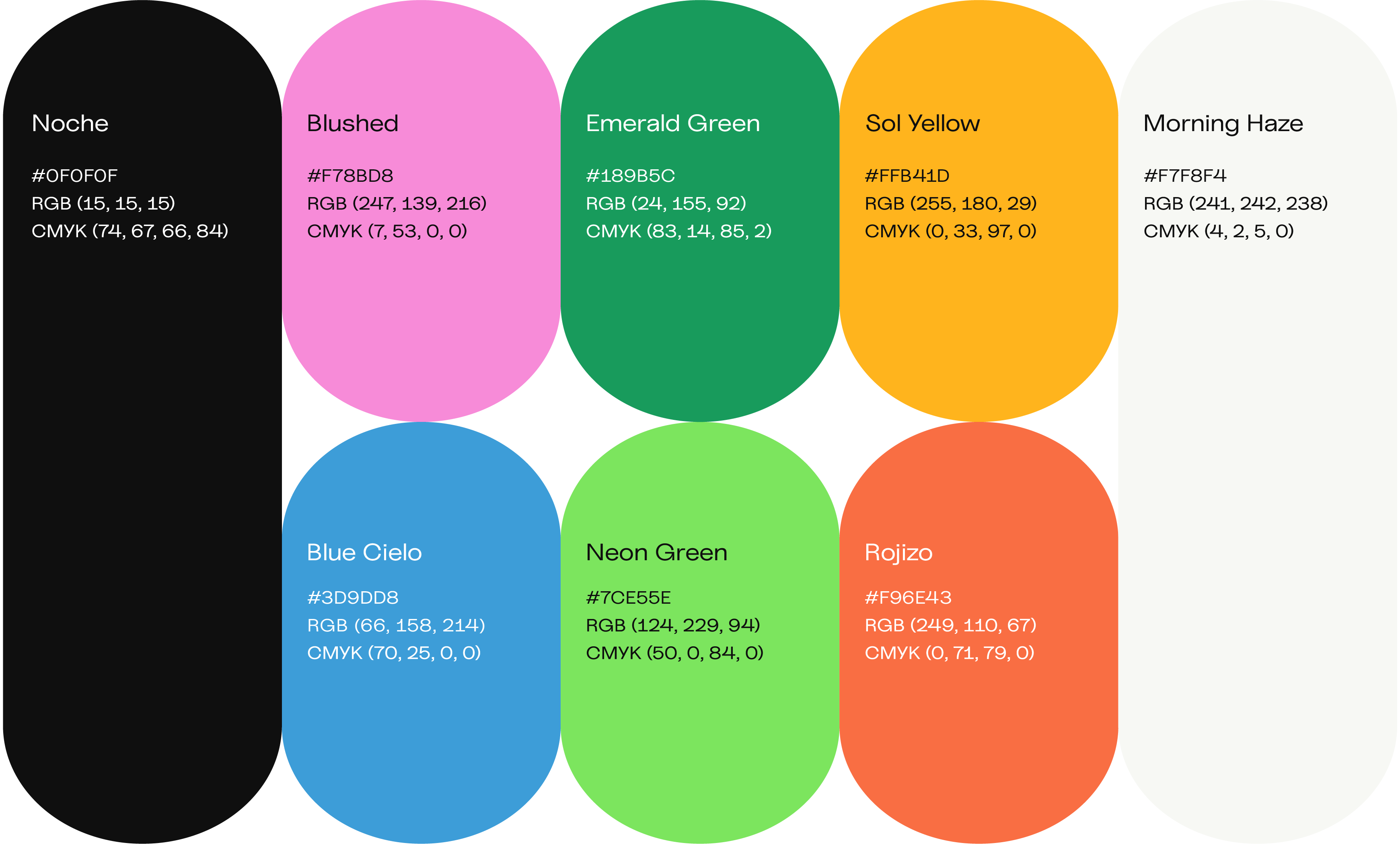
Our diverse global team deserved a colorful yet sophisticated color palette that evoked our level of personal engagement and excitement for our craft.
We developed a well-rounded selection of key colors inspired by the tones of the earth and the passions that drive us, assigning a blend of english and spanish descriptive titles as a nod to our international roots.
The Terraforms
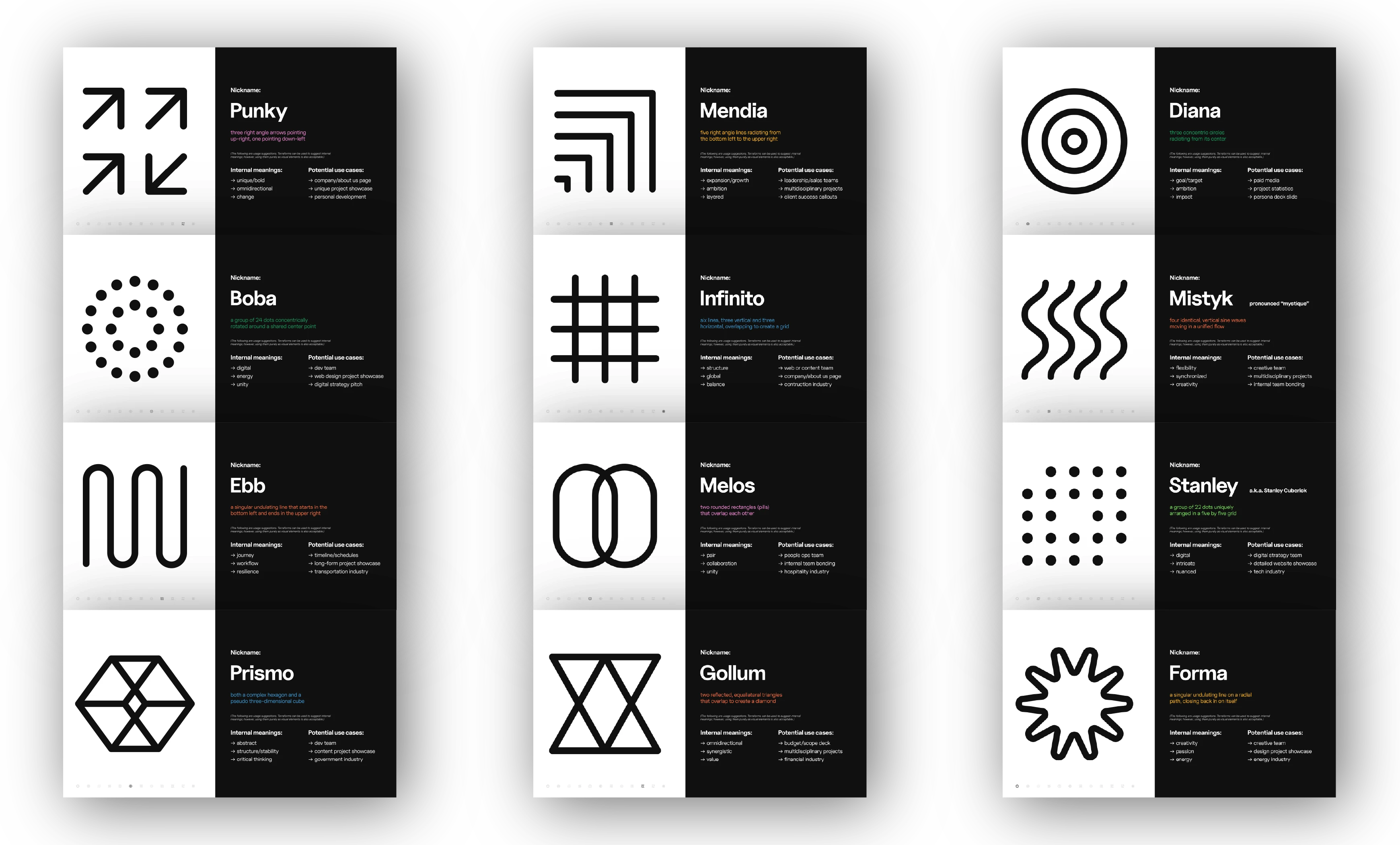
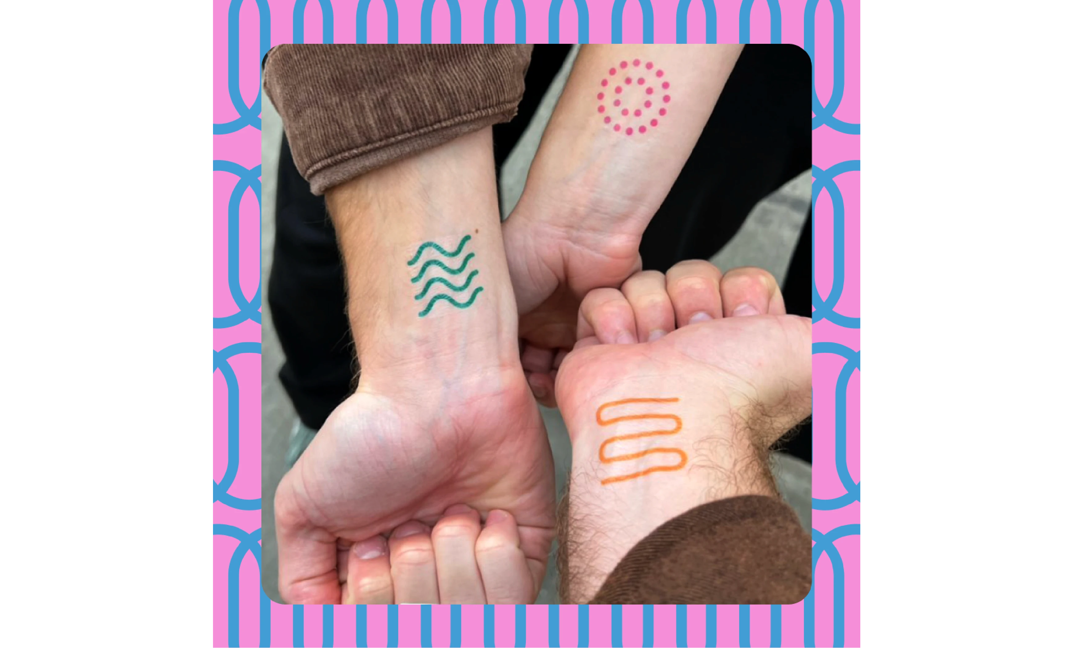
We rejected the conventional approach of a single logo icon in favor of a dynamic new modular identity built on a family of symbols we call terraforms.
Their strength lies in their ability to assemble in groups to suggest a variety of cryptic meanings, while also standing on their own thanks to their unique individual personalities.
“Under Thomas’ leadership, Terra undertook a transformative rebrand that proved to be as bold as it was impactful for our business. The striking new visual language he developed has distinctly positioned us as innovators in the creative industry.
His visionary work not only produced a great brand, but also significantly elevated our public profile. In my 10 years of running a creative agency, the rebrand of Terra stands out as a unique accomplishment — one that would never have been possible without Thomas.”
Remy Bernstein
Managing Partner, Terra
CREDITS
Creative Direction - Thomas James & Connor Goff
Graphic Design - Thomas James, Connor Goff, Alma Hortelano
Brand Strategy - Thomas James, Connor Goff, Daniel Bakare, Alexa Lee


